In case you missed it, we recently celebrated the 30th Anniversary of the Americans with Disabilities Act (ADA). On July 26, 1990, President George H.W. Bush signed the ADA into law, kickstarting a movement that has provided both protections and opportunities for the millions of Americans living with disabilities.
In addition to improving physical accessibility in buildings, providing reserved parking and offering modified work schedules, there are several improvements to be made to make the lives of Americans with disabilities easier, especially from a digital standpoint.
The last time we discussed ADA, we focused on ADA-compliant websites. Just as important, however, is accessible color theory. Let’s dive in.
What is Color Theory?

In general, color theory “refers to the standards and the concepts related to the use of color that can be applied in various types of design and art.” Remember the color wheel (red, yellow blue, primary colors, secondary colors, etc.)? If not, let’s take a trip down memory lane; it’s important to understand the three concepts of color and how to incorporate them into your accessible website:
- Complementation refers to the way colors relate to one another. Colors on opposite ends of the color spectrum are more visually appealing, add balance to the eye and avoid straining.
- Vibrancy is simply energy and emotion conveyed through color. It can also guide your audience to specific products, instructions or actions you want to highlight. For example, brighter colors can be used for graphics to generate excitement, while darker colors can be used for text when providing scholarly information.
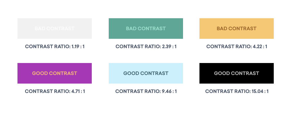
- Most relevant for accessible design, contrast creates visual interest by creating clear separation between items. Effective use of contrast reduces eye strain and focuses user attention by clearly dividing elements on a page. It’s typically best to use light colors for backgrounds and dark colors for text; effective contrast is one of the stark differences between an accessible design and one that is not.

These elements, used with adequate text ratio (which we’ll cover next), are crucial for accessibility.
Text Matters, Too
Those with complete or partial color blindness may have trouble reading your website without additional accommodations in place. When color cannot guide them to a certain button or action, accessible text can do the job. Some necessary considerations for creating accessible text:
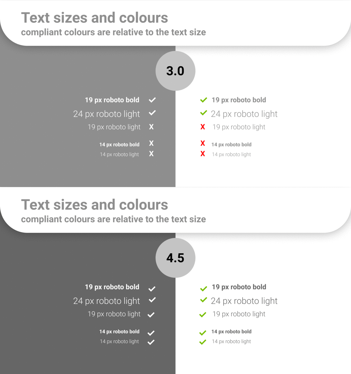
- For small or regular size text (12px or less) the contrast ratio between the text’s color and background color must be at least 4.5:1.
- For large text, (18px text or 14px bold text) the contrast ratio between the text’s color and background color must be at least 3:1.
- Ensure your website’s text can be easily converted for screen readers or other assistive technologies.
- Avoid using images rather than text – this allows users to adjust the size and color of the text as they see fit.
- Use colors with symbols (such as asterisks, colons or arrows) or words to indicate importance.

Test, Test, Test
Wondering how your design elements — or entire website — stack up against ADA guidelines? The Web Content Accessibility Guidelines (WCAG) are a set of standards created for web developers to maintain web and mobile accessibility. Additionally, there are a number of resources available that can test the contrast of your website elements, including:
- Chrome and Firefox add-ons
- Contrast Oracle, a software that stimulates color blindness
- Contrast Checker, a website that calculates the contrast ratio of foreground and background colors

Accessible is the Aesthetic
From a creative standpoint, proper use of color in web design can, of course, stimulate emotions, generate sales and make your website look pretty. However, making your content accessible to all, including those with visual impairments, is great design in itself. As marketers, our goal is always to reach as many prospects as possible. An aesthetically pleasing website that doesn’t function well for all users is not only exclusive, it’s bad marketing.
At Look Listen, all of the content we produce is ADA-compliant to ensure a memorable digital experience for everyone. Ready to audit your site? Get connected now.
Featured Image by Tirza Van Dijk on UnSplash


