Americans, on average, are exposed to roughly 4,000 to 10,000 advertisements per day. Yes, you read that right. In the age of information overload, good content marketing is rendered ineffective without a strong call to action (CTA). It’s important to capture your audience’s attention from the moment they lay eyes on your advertisement or email — but it’s even more important to inspire them to take action.
When creating clear, persuasive copy for your CTA, make sure you’ve covered the basics. CTAs should be action-oriented, succinct, and emphasize a sense of urgency. In most cases, your CTA should let users know exactly what they’ll get when they click it.
When you’re finished, ask yourself, “Would I click that?” If you’re stuck, read on for tips to ensure your prospects and customers stay on the journey that leads to more growth for your business.
Do: add a heading and subheading to your CTA.
Your CTA button may need a little additional context in order to be effective. According to Hubspot, it’s best to include three important elements: “The headline grabs their attention, the subheading draws them in deeper and the CTA tells them what to do.” This combination helps guide your customers to exactly the action you want them to take and tells them why they should take it.
Don’t: use third-person.
Your CTA is all about the user. Instead of: Schedule a Tour, try swapping in: Schedule my Tour Now. Using an A/B test applying various design and copy combinations, ContentVerve saw a 90% increase in click-through rate by using first-person phrasing: Start my Free 30-day Trial vs. Start Your Free 30-day Trial.
Do: offer relevant resources.
Offering your customers resources that can improve their lives will provide them with immediate gratification. Informative brochures, personalized proposals and links to related tools will show your site visitors that you are thinking of them, not just selling to them.
Don’t: use too many CTAs.
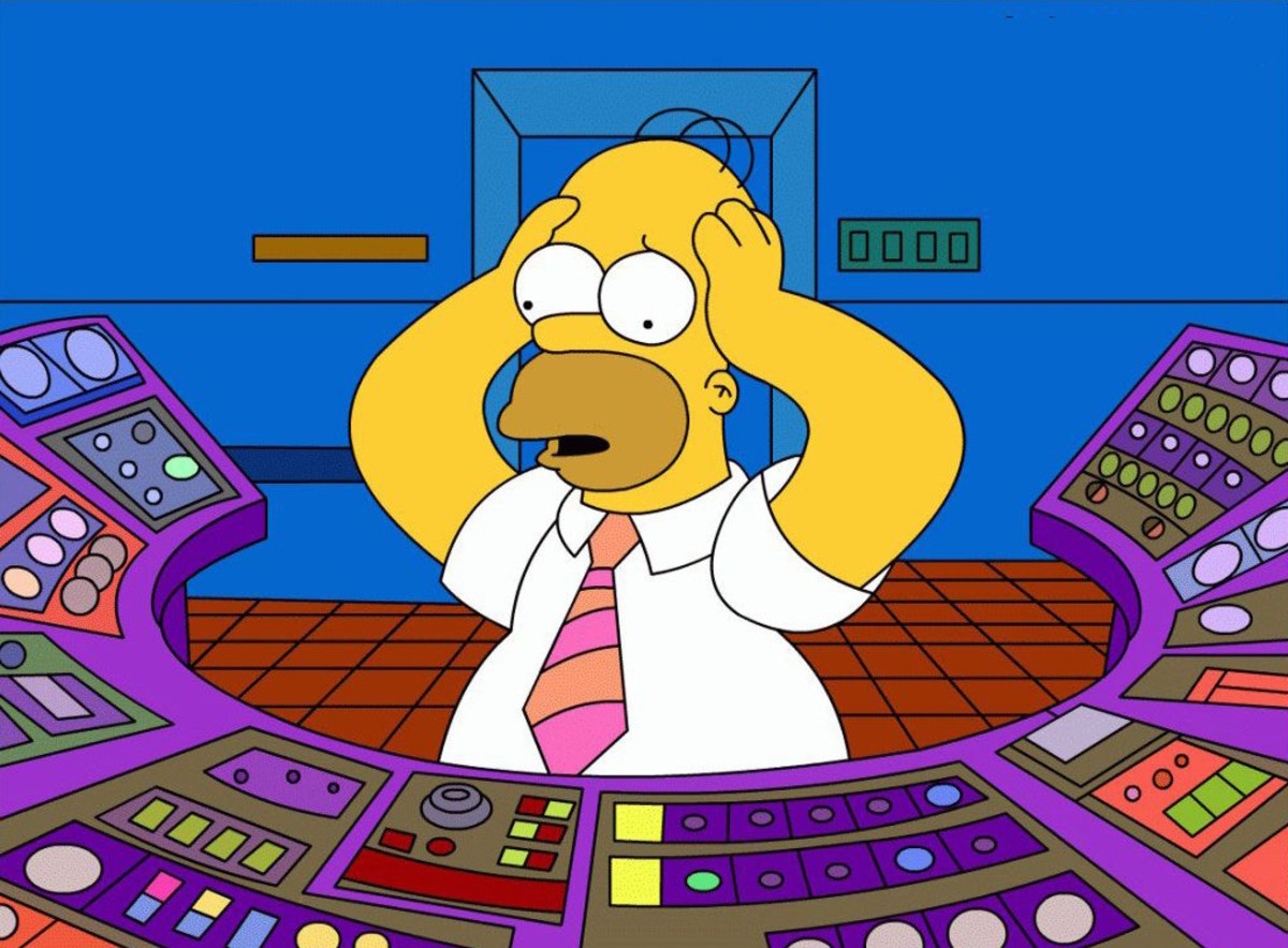
Keeping your CTAs to a minimum ensures visitors stay on track and are directed only to the primary or secondary action you’d like them to take. While every marketing asset should have at least one CTA, the use of several Click Here buttons on your email or landing page could confuse, annoy or tire out your prospects.
Do: utilize the word free.
No matter what product you’re selling or service you’re providing, a free opportunity to try it is hard to resist. Adding a Start my Free Trial or Try for Free button to your site may bring some new interest to your business, and eventually result in a sale.
Don’t: be vague.
Learn More is vague, lackluster and may cost you conversations. It’s best to provide visitors with a tease of what you’d like to offer them. If you want customers to share their email with you to receive a quote, your CTA should say something like: Double Your ROI in Six Weeks.
Do have fun with it!
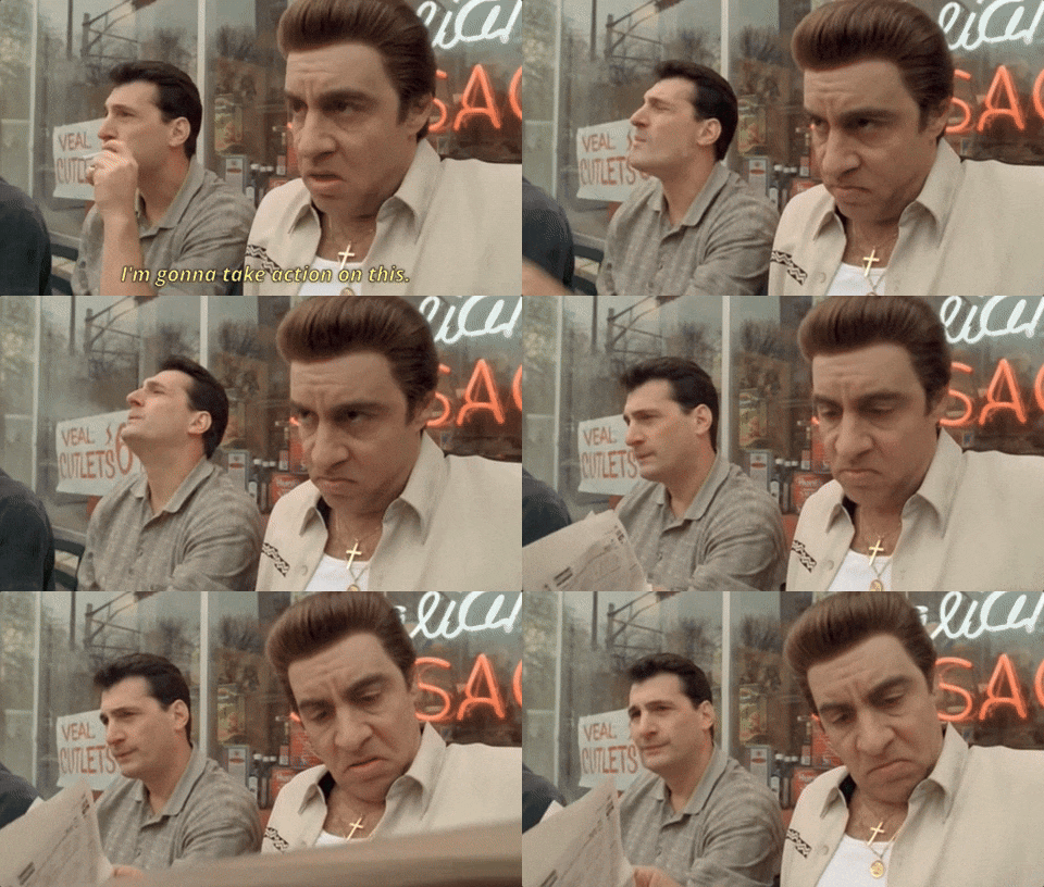
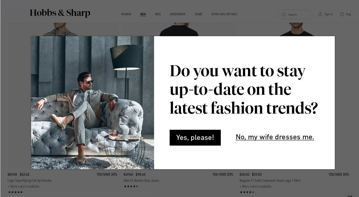
Humans love to laugh and are more likely to spend money on things that make them happy. Get to know your audience and find out what makes them smile. If your brand’s voice and tone allow for it, a playful yes/no question can entice visitors to avoid the no answer in favor of a click on your desired action. Unless their wives dress them…
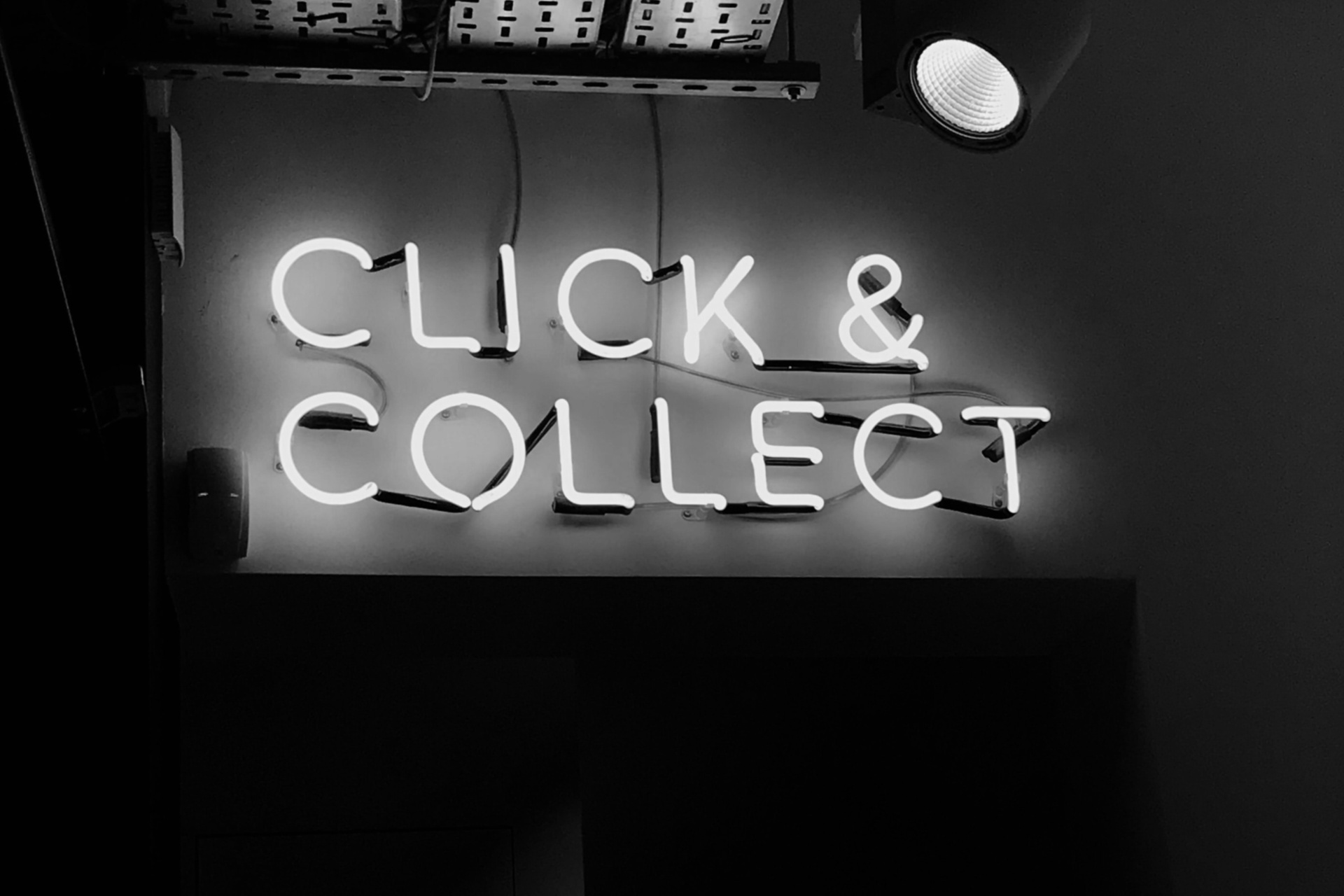
Don’t use Click Here.
UX Movement believes you should never use Click Here because it “takes the user’s attention away from your interface and onto their mouse.” The CTA button should let visitors know where to click all on its own; a well-designed CTA button does not require a specific instruction on where to click.
Looking to take your Click Here to See for Yourself? Let’s talk about ways our Creative Team can make it happen.
Photo by Henrik Dønnestad on Unsplash

