It’s no secret that we experience the world around us through letters and words. I mean, you’re reading and experiencing this blog post right now… through letters and words! Here at Look Listen, we like to think typography is just as important. What’s McDonald’s without its signature logo? So, let’s talk about the essentials of typography. We’ll cover a little history (talking to you, Gutenberg), along with the anatomy, personality, and future of typography as we know it.
A Brief History: Introduction to Typography
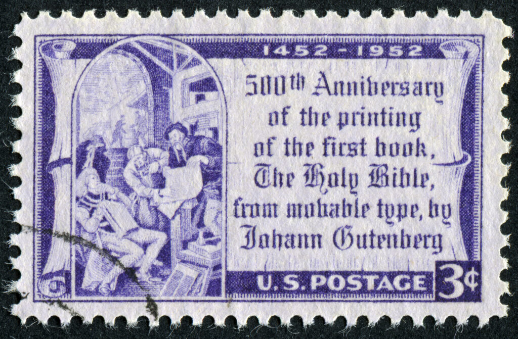
In the beginning (a.k.a in 1450), Johannes Gutenberg created the first movable type out of lead alloy that proved to be so effective, it’s still used to this day. For the first time in history, mass production of texts was possible thanks to the Gutenberg Press. This revolutionary invention launched the Printing Evolution.
Fun fact: the first book printed was the Bible. There are only 49 copies still in circulation, and they are subsequently known as the “Gutenberg Bibles.”
Legibility Reigns
If you’ve ever seen calligraphy from way back when, you’ll likely agree it’s unarguably beautiful. But, can you read any of it? If you’re like us, the answer is: not well. The first typefaces in Europe were modeled after the ornate style of writing used by scribes. At the time, most people (who could read) were used to reading this beautiful, complicated type.

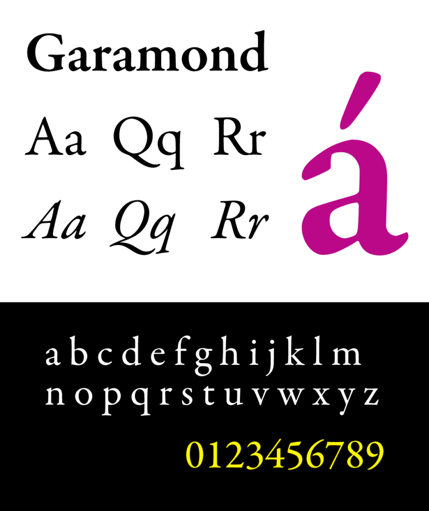
This style of difficult-to-read-but-lovely-to-look-at-writing is now referred to as “Gothic.” A reaction to the Gothic typeface was the Garamond typeface, which was developed in the Renaissance period along with other Roman styles. These styles have thinner curves and serifs, resulting in a cleaner, more legible page. Eventually, these evolved into the serif typesets popular today in Western printings.
We have just one question: Are you a serif person or a sans-serif person?
The Anatomy of Type: Terms, Classifications, and Properties
The only time you’ll hear us talking anatomy is when it comes to breaking down the body parts of letters. Believe it or not, all letterforms have specific terms used to describe their individual pieces that make up the whole.
From sans-serifs to serifs, they all have legs, arms, ears, shoulders, tails, spines, you name it!
Let’s break down the main pieces of typography you’ll most often hear referenced:
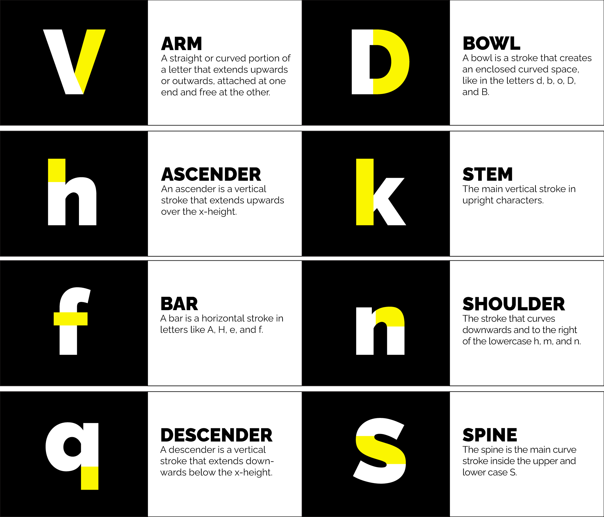
While we’re at it, we’ve put together a cheat sheet of some of the most commonly used terms surrounding the anatomy of type. Check it out:
X-Height: The x-height isn’t exactly a part, but rather a measurement. It measures the height of all lowercase letters that are part of the same typeface. It’s called x-height because the letter x of each typeface is what determines the measurement.
Cap Height: The cap height is a measurement of all capital letters in the same typeface. The most accurate measurement is found in flat-bottomed characters like the letter E.
Kerning: The space between individual letters. It’s used when you need to move only one letter because it is too far or too close to its companions.
Tracking: The proportional space between all the letters in a body of text. When you change the tracking, it helps fit more letters in a small space or spread out letters if they are too tight.
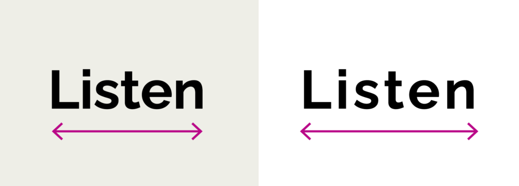
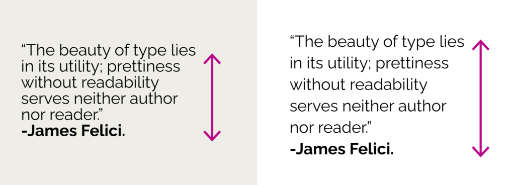
Leading: The space between baselines. This means that when we manipulate the leading, we are changing the way a paragraph looks.
We Are Letters and Words: Type as Personality
Words and letters are in practically everything around us. In our modern culture, people identify brands and products based on their carefully chosen typography. How typography is used and designed can evoke a mixed bag of feelings. It can be sleek and modern, dark and grungy, fun and playful, or old and classic! While a brand logo may not have any typography at all (think the unforgettable Nike swoosh), a wordmark is a text-based logo (think the stunning Coca-Cola red cursive letters).
What are some of your favorite brand wordmarks (other than the Look Listen wordmark, of course)?

The Future Of Type: Considering New Standards
As a marketing agency, Look Listen is no stranger to the ever-evolving, ever-changing landscape of our industry. We never want to stop learning, and we know standards and practices change in an instant. So, what are some current best practices for typography in relation to digital marketing?
Best practices around web text often differ from printed text, and there’s a lot more to account for when it comes to rules around the web. Digital typography needs to…
- Capture shorter attention spans
- Remain readable
- Adhere to accessibility standards
- Stay compatible across multiple digital devices (from your big ole computer monitor to your small phone)
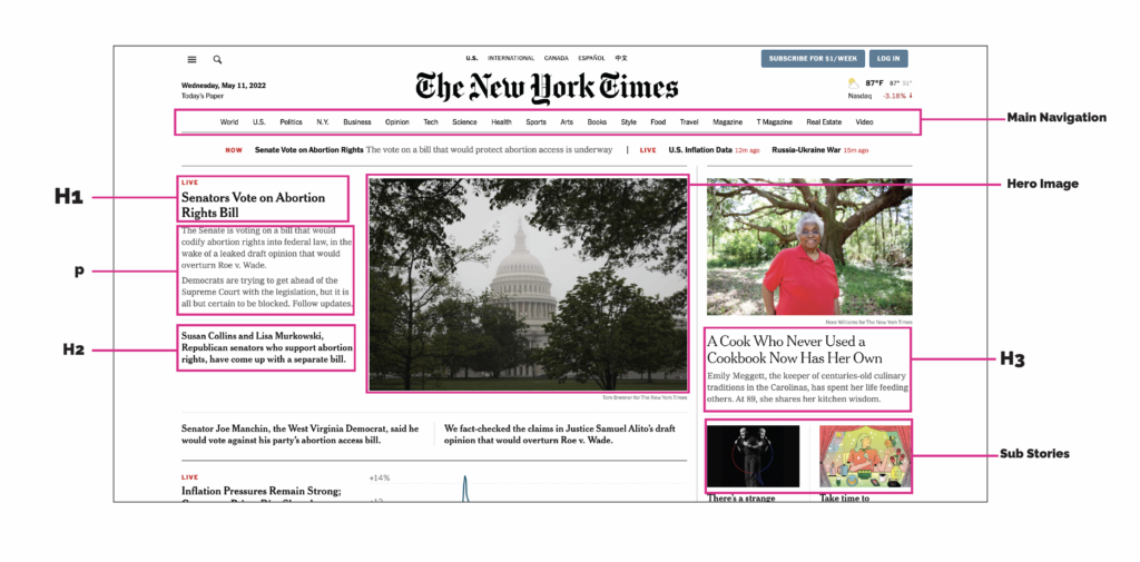
Let’s talk typography hierarchy (say that five times fast) for web pages. Most web pages, especially text-heavy ones, break content into sections by topic. These sections are signified and labeled by headings. The order of text, from most prominent to least prominent, comprises the hierarchy of the page. Hierarchy is crucial for making pages easily navigable and digestible. Readers should be able to jump to whichever section is relevant to them by looking at headings alone. You can see this example that we broke down on the New York Times home page.
How do you standardize text fonts? With so much information out there, is there a way to know? A common practice is to set all website text to a minimum and maximum size. You can (and should) increase and vary the size of your text to further assist readers and establish hierarchy, but don’t go overboard with massive fonts either!
Want to know our recommended font sizes for body copy? We’ve got you:
Final Tip: If you are a brand or a company, find a font you will use across all integrated marketing. Along with your company font, design a logo that will resonate with your audience and leave a lasting impact. Typography is powerful!
We’re Here to Help
To ensure you’re using typography efficiently to propel your brand, contact us to get the conversation started.
Resources & Further Reading:
Thinking with Type – Ellen Lupton
The Visual History of Type – Paul McNeil
The Anatomy of Type – Stephen Coles
On Web Typography – Jason Santa Maria
The Responsive Website Font Size Guidelines
Designing for Readability – A Guide to Web Typography


