Designers and editors, this vocab lesson is dedicated to you and your pursuit of elevated typography. You already know what all of these terms mean, but the clients or account managers you work with may not. So we’ve presented an easy guide that helps get everyone on the same page (and text on the same line).
Widows & Orphans
You can think of widows and orphans as different sides of the same coin. The widow is a line of text at the end of a paragraph that stands alone at the top of the following page/column. A widow can also be a single word that ends a paragraph/sentence/headline, etc. that lives on a line all its own.
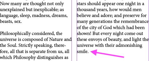
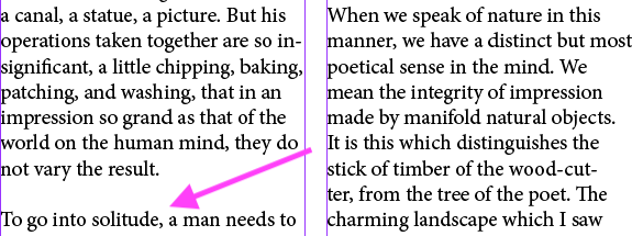
The orphan is a line of text at the beginning of a paragraph that is alone at the bottom of a page/column. It’s far less common for an orphan to exist as a single word at the beginning of a paragraph/sentence/headline, simply because it would be a highly visible error. But, the term would still apply.
If you need a little help remembering these terms when it comes time to applying the concepts, there are several (fairly bleak) sayings that can help you lock it in:
“An orphan is alone from the beginning; a widow is alone at the end,” or “An orphan starts alone, a widow ends alone.”
Rags
Slightly less dramatic as far as terminology goes, but just much a faux pas in design as our previous terms, a rag refers to an uneven vertical margin in a block of text. Basically, you want to avoid a margin that creates strange shapes that might distract the reader.
When looking at margins, also keep an eye out for any words that might have been split awkwardly (or at all). You want to enhance the natural pace of reading, not introduce anything that might detract from it.
Rivers
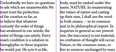
So named because they create the illusion of a river of white space through a block of text, rivers can happen when text is fully justified, or when using monospaced fonts. The phenomenon can also occur when long words are used multiple times within a paragraph at around the space spot on different lines.
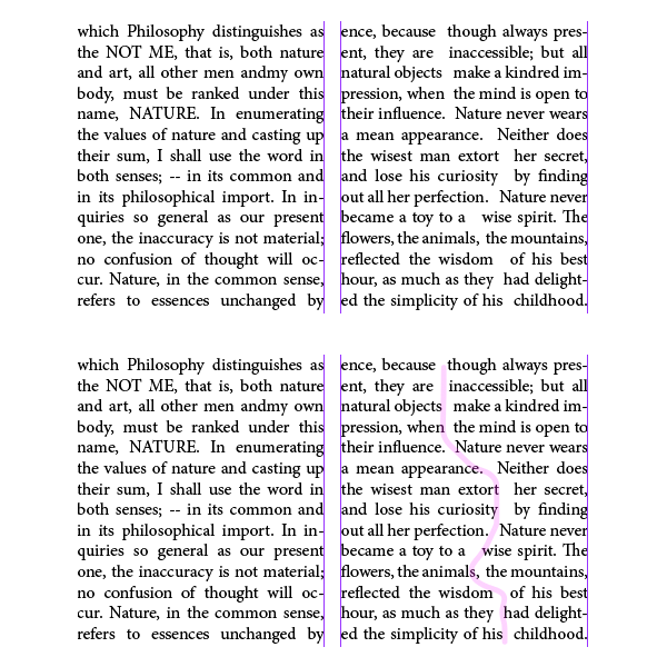
You can also find a lake or a hole when a series of rivers are near each other or even intertwined to create a light area within the block of text.
Pro tip: If you’re finding it difficult to locate the rivers and lakes (like you’re used to), turn the piece upside down. When you can’t recognize the words, you can focus more on the form.
Are there any typography mistakes we’ve missed? Do let us know.
Photo by TaiLi Samson on Unsplash


