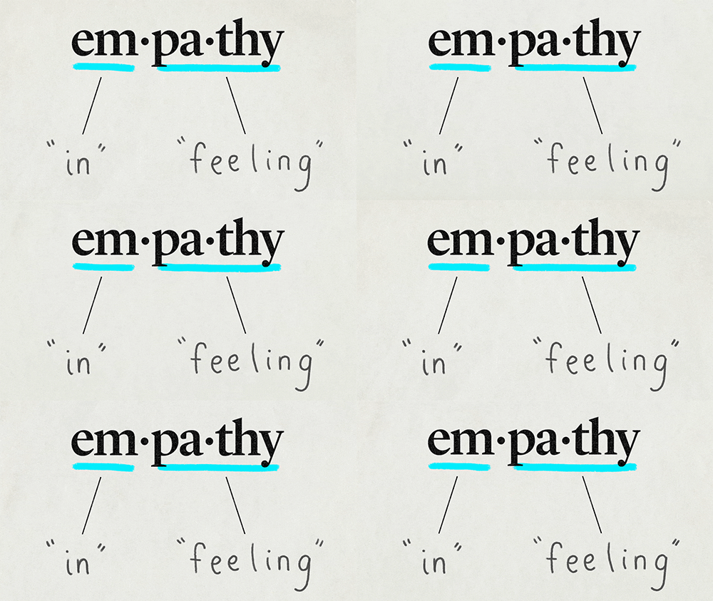
Empathy is a crucial component of any successful design project. Understanding your audience — or not — can greatly determine the effect of your design. Does your creative offer an engaging human experience? Or are you hitting a brick wall when it comes to connecting with the user?
These are questions we asked ourselves recently when we connected (virtually) with a panel of UI/UX designers, researchers, and writers as part of their Empathy and Psychology Design online event. The panel, provided by General Assembly, focused on defining empathy in design and outlining how it is used within Human Centered Design. The panelists discussed how to frame assumptions and observations about the audience, as well as how to use that knowledge to create a well-designed product.
Let’s dive in and find out how we can be more empathetic as designers (and as humans).
Why is Empathy Important?
Designing meaningful experiences involves multiple steps in the design process. Understanding what your audience is thinking, how users make decisions, and the psychology of those decisions is all part of the strategy and the resulting empathy is one of the most important aspects of design.
The human mind is incredibly complex. Each of us has a unique experience, background and story. When we’re able to connect with people on a deeper level, we’re able to sell, advertise or deliver a product or service from a perspective far more effective than simply: “I want you to use this.” When we are unable to truly understand what our audience thinks and how they make decisions, the likelihood of them connecting to our product or service decreases substantially. When’s the last time you bought something after seeing an ad that turned you off?
What is Human Centered Thinking?
We all know how important it is to save money and keep our stakeholders happy. But without investing the time and resources needed to understand our audience, the product won’t be effective anyway. During the panel, one designer put it this way:
“Connecting with your audience early on saves money in the long run because it reduces the money wasted on attempts to hit target audiences blindly.”

With Human Centered Thinking, designers are driven to create a product that addresses the core needs of a consumer’s problem. To put it plainly, this solution-oriented methodology puts humans at the center and forefront of design. One good example of Human Centered Thinking in action would be the Norman door. We’ve all accidentally pulled a push door handle or pushed a pull door handle (it’s okay, we’re not judging you); in fact, when humans see a handle, they are naturally prone to pull it. A UX researcher named Don Norman fixed that problem by creating the Norman door, which is a door that includes a handle when it needs to pulled and is missing a handle when it needs to be pushed. This invention has not only saved humans time and frustration but it has also been created with the user in mind.
The seatbelt, however, was designed with data bias (which is data that is unrepresentative of the population) and developers failed to consider women’s bodies. For decades, crash dummies have been based around a 50th percentile man and explain why women are 50 percent more likely to die in car crashes than men. Plus, as those of us who are women can attest, seatbelts are uncomfortable. It’s clear the seatbelt was not designed using Human Centered Thinking.

Assumptions: Dangerous, but Necessary
To ensure success, there is a significant amount of research done in the early stages of Human Centered Thinking. After this step, designers are tasked with making observations and assumptions about their target audience to deliver the best output possible. The trick is learning to make observations while being empathetic and unbiased at the same time.
With this methodology, designers are encouraged to use their own internal understanding and experiences to supplement findings from research and testing. For maximum effectiveness, expert researchers should be utilized in order to give insight regarding an audience. While this method of retrieval can be costly, it allows teams to save money for stakeholders and prevent bad design assumptions.
Humans First!
As we’ve mentioned before, connection is vital. Your project has the potential to meet a user’s wants and needs, creating powerful brand loyalty at a time when consumers have more choice than ever. Designing from a place of empathy — from start to finish — will make all the difference.
When designing with empathy, especially when it comes to digital, it’s imperative to account for ADA compliance and accessibility. We understand it can be overwhelming to get started (or to know where to start), so we’re offering to audit your website for free and with no obligation.
To ensure you’re designing with all users in mind, simply shoot us an email, include your site’s URL, and we’ll quickly turn around a detailed report with guidance for getting compliant.
Featured Image by Christian Wiedige on Unsplash


