As creatives, we’re constantly scrutinizing our own work for opportunities to improve upon it, especially when there’s some daylight between then and now. Recently, we took a good hard look at our logo and decided — though it has served us well — the time was right for an upgrade. We wanted the new mark to hold on to the brand equity of the original while encapsulating the refinement and sophistication that’s been the result of our company’s growth. Our design team went deep into the data, and we’re incredibly proud of the result. But before we get ahead of ourselves, let’s take a look at the work.
The Original
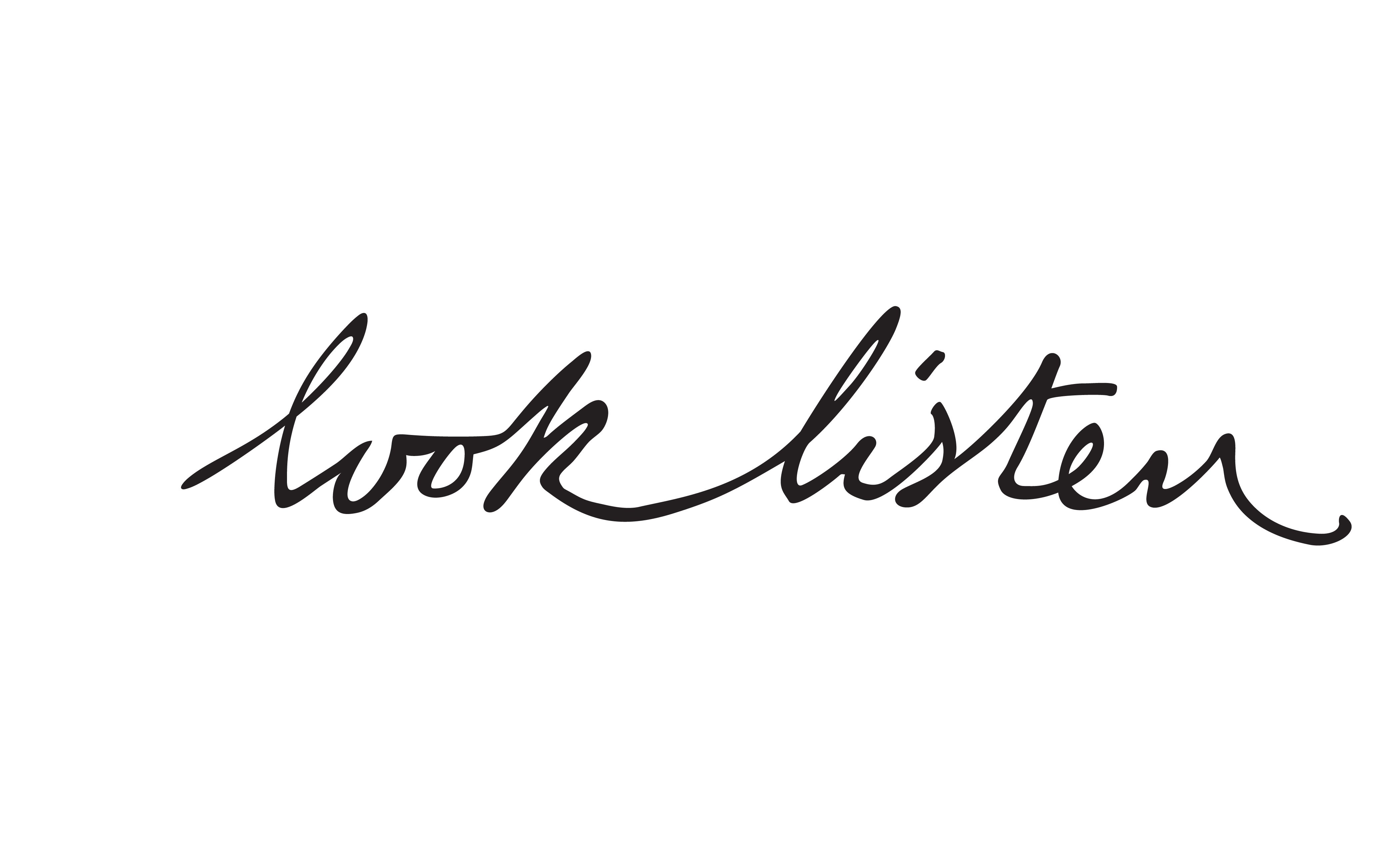
Look Listen co-founder Kit Hughes crafted the original logo using a pencil, inspired by the human-centered design that was to guide the direction of the company as a whole. Once the variation was selected, we digitized it, and a box and color background were added as logo variations when the script alone proved too minute to be read from far away, especially in in-person contexts.
Consistency is Key
When our logo was digitized, the typography accumulated a few kinks and bulges along the way, resulting in a range of inconsistencies distracting to the human eye. The differences within the original script made the handwritten type feel more human (note the varied cap height, x-height, and base shown below). However, the lack of consistency weakened the mark. So we decided it was time for a change.
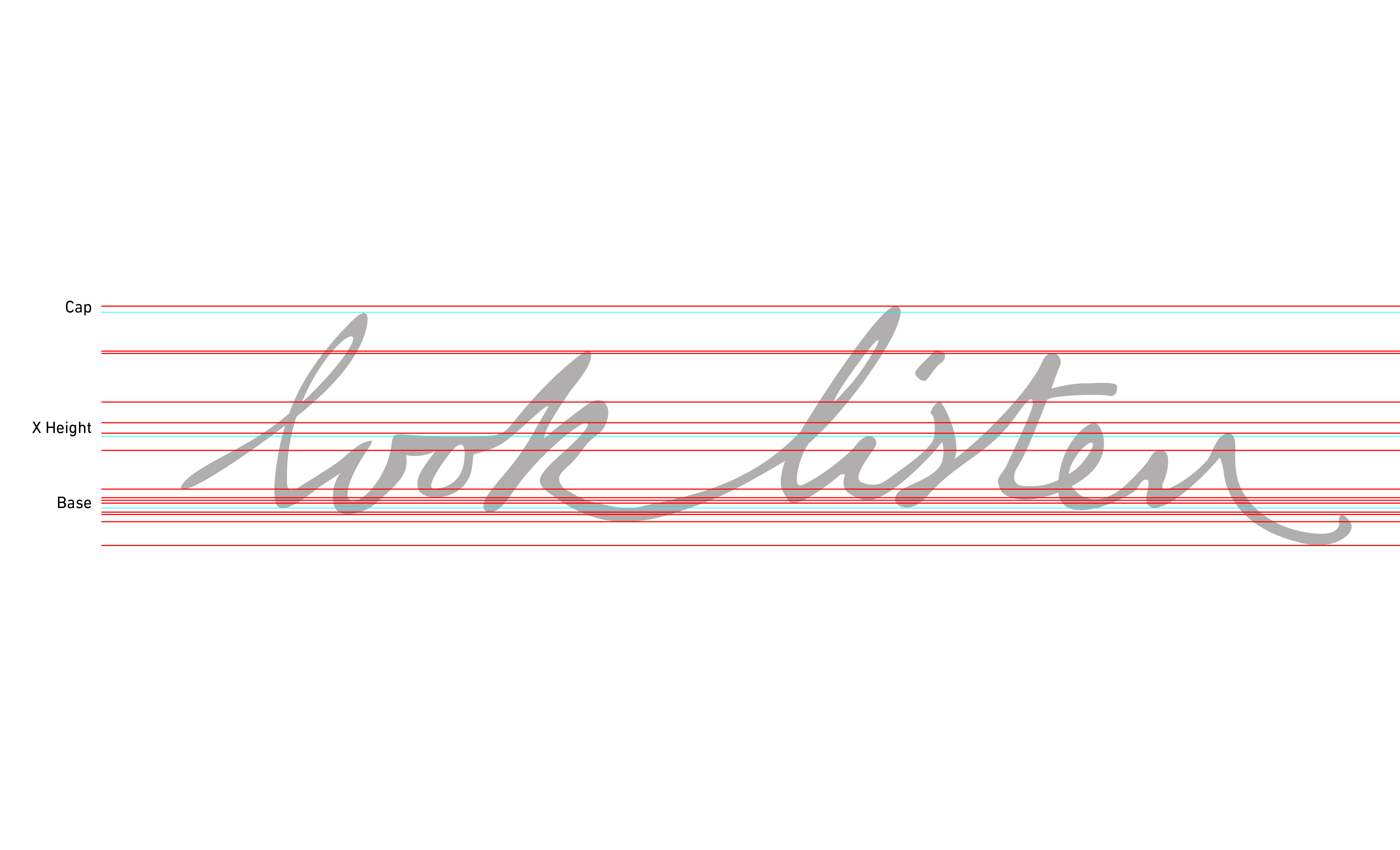
The main concern was the void of believable differentiating line weight. With a traditional stroke of a fountain pen, the stem of a letter should appear thicker than its hairline counterpart. Other parts of our script that needed improvement included:
- The inconsistency within underturns between letters and their line distribution
- The widened gap between the words “look” and “listen”
- The crotch differences of each letter
- The inconsistent starts and stops of each letter
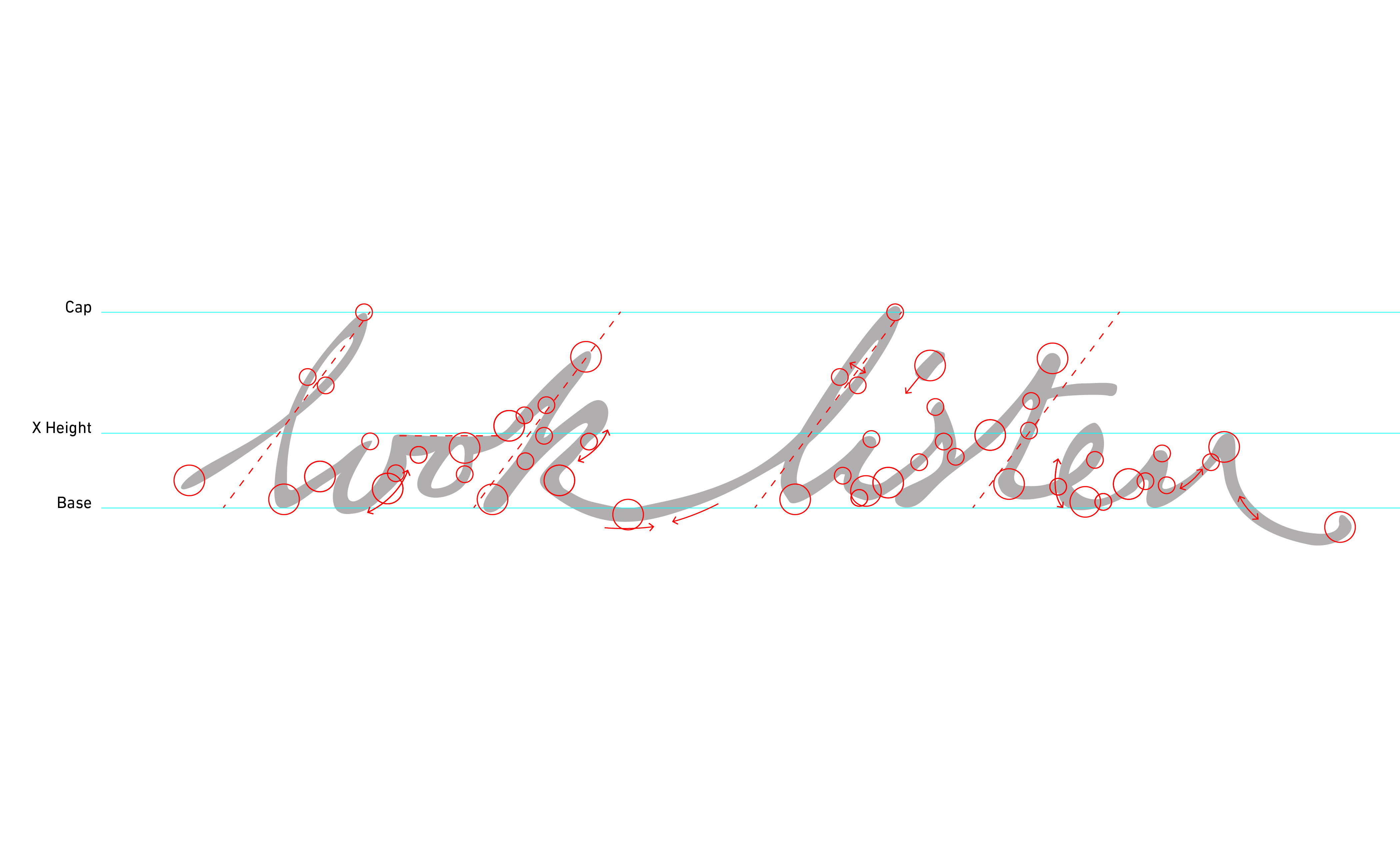
Once we identified where we could enhance our logo’s overall design aesthetic, we were able to get to the fun part.
The Remix
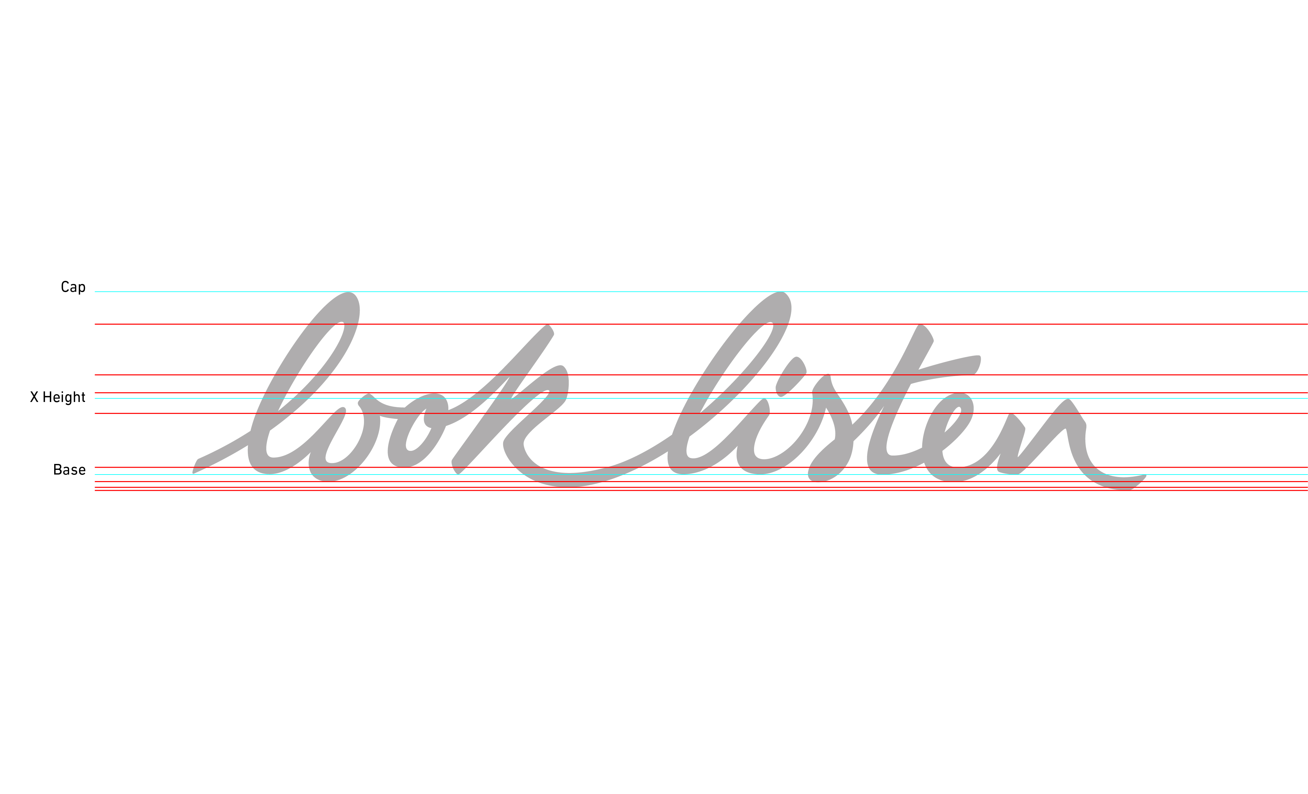
The adjustments to the new logo not only cleaned up our problem areas, but also kept the handwritten look and feel of the previous logo. Additionally, by thickening the line weight, we were able to strengthen the brand and enhance the script’s legibility. The stems and hairlines are now consistently weighted throughout, the tittle of the letter “i” has been lowered, and the width of “n” strokes has decreased, making each letter more recognizable. There’s a balance between human and machine, and between emotion and logic that reflects how we approach all our work.
“Given our strong brand equity in a handwritten logo with a distinctly human feel that ties to our purpose of improving human experience, we wanted to refresh and evolve the logo while keeping the original spirit alive,” Hughes said. “The rigorous analytical deconstruction of the mark to arrive at the final design is the way we like to approach projects like this, and it’s exactly how we like to work for our clients.”
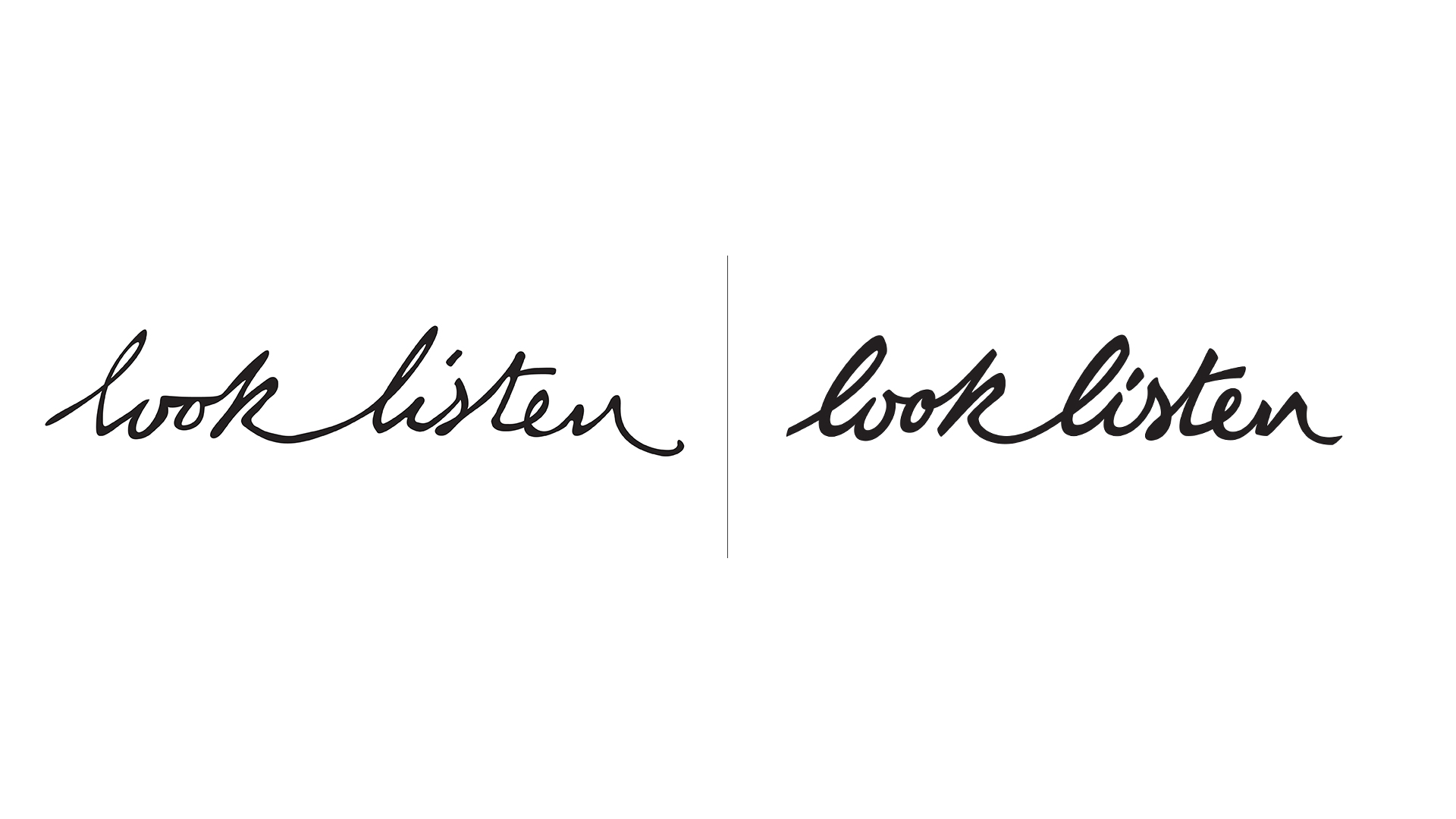
Status: Feeling Fresh

We all know the importance of a strong logo. It’s a first impression, a means of distinction, a memory device and — crucially — the visual embodiment of a brand’s mission, vision and offering. It’s no wonder we spent so much time perfecting stems and strokes.
Does your logo or branding deserve this same attention to detail? Get connected today.
Photo by Art Lasovsky on Unsplash

